
The Client
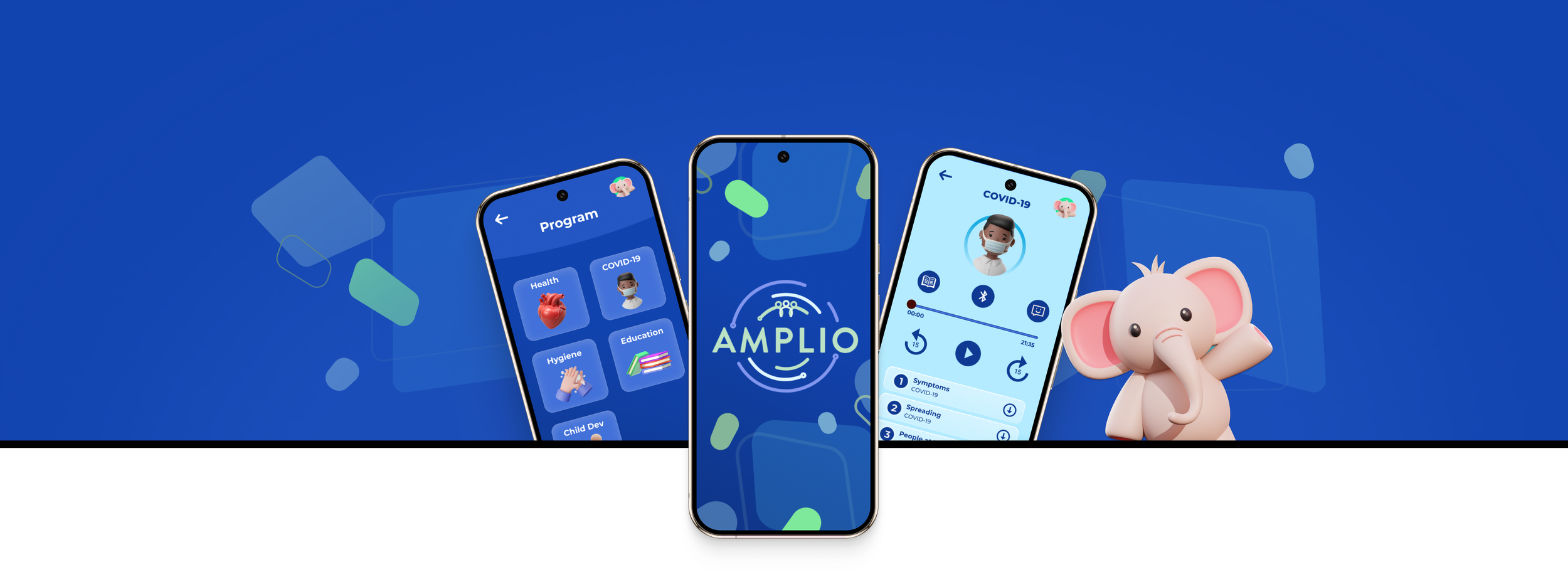
Amplio, a Ghana-based organization dedicated to sharing knowledge with the world's hardest-to-reach communities, developed a handheld audio device to deliver educational content to remote communities across Sub-Saharan Africa. Known as the Talking Book, this device provides vital information on topics such as health, disease prevention, child development, agriculture, and more.
With the rapid advancement of modern technology and the challenge of keeping educational content updated in real-time, Amplio sought a new solution—an app that could carry forward the Talking Book’s mission while expanding its reach.
My Role
User Research, Design Systems, Visual Design, Presentation Design.
Collaborators
Ariana Zahedi (UX/UI Design, client liason) and Keli Hurst (UX/UI Design)
Softwares
Figma, Adobe After Effects
The challenge
How do we transform the Talking Book, a purely audio-based hardware device, into a mobile app that retains its simplicity and accessibility for users with zero to low literacy, limited tech exposure, and minimal internet access?
Goals
Amplio aimed to develop an app that would successfully incorporate the following key features:
Provide audio-based content that is accessible offline.
Enable users to record feedback and respond to surveys.
Design with inclusivity in mind—especially for users who have never interacted with modern apps.
Support multiple languages and offline functionality.
Follow the checklist provided by the client.
The Research Phase
No direct access to end users. What now?
Due to challenges such as language barriers and limited connectivity, we were unable to conduct direct research with the target audience. To work around this, we focused on these research methods:
Staff Interviews: Conducted in-depth interviews with Amplio staff to gather user insights and understand the challenges users face in rural, low-literacy environments.
Expert Consultations: Learned from experienced UX professionals and mentors to inform decisions about inclusive design.
Secondary Research: Studied articles and reports on designing for illiterate users.
Competitive Analysis: While the competitors offered voice personalization, they lacked offline durability—something Amplio excels in with the Talking Book.
Research Findings
Literacy levels vary across regions, so we can’t know for sure the level of literacy of the users.
Liimited internet connectivity is a reality. One of the benefits of the Talking Book is that it doesn’t require any electricity or internet. So, with the app, it is important for users to have the ability to download content, so they can access information offline when they lose their internet connection.
The current Talking Book does not have a way to measure information retention. There is currently no way to know whether the user has truly learned the material, so we knew from there for example that a quiz could be beneficial.
The original Talking Book was designed to be easy to use, not complex. We know that we need to use the same approach for the app, while introducing users to modern iconography and helping them adapt to smartphone capabilities.
Ideation
How Might We?
For this phase, I used the “How Might We” (HMW) questions to frame challenges as open-ended prompts that inspire solutions. This approach helps me focus research on user needs and encourages creative, targeted problem-solving.
How might we ensure users in remote communities can fully access app content despite limited or unstable internet?
Video tutorials
Voice command navigation
Visual-first UI with icons instead of text
Audio prompts in local languages
How might we help illiterate users navigate and use the app effectively without relying on text?
Peer-to-peer content sharing (via Bluetooth or Wi-Fi)
Offline Mode with downloadable content
Progressive Web App (PWA) for caching and offline access
How might we introduce new features in a way that’s easy for illiterate users to adopt?
Interactive onboarding with audio-visual guides
Pictorial menus using universally recognizable icons
Voice-activated navigation and commands
Client-specific requests.
Amplio aimed to develop an app incorporating these nine key elements.
Project library
Project specific content library available by language and playlist.
Public library
A public library features content from other projects.
Modern player
A modern Message Player, with play/pause, rewind/fast-forward, message speed, skip to next/previous message in a playlist.
Language options
Users can switch from the default language to other available options.
Two different modes
Two modes support different literacy levels: 'Basic' replicates the original Talking Book, while 'Classic' adds modern features.
Survey functionality
Simple audio surveys users can respond to.
Content available offline
So users can select which project content to save to the device.
Access code
Access via code provided by the project or partner.
Message recoding
Allows users to respond to messages or record general voice notes.
An app 100% audible and simple as possible.
Solution Strategy:

The friendly assistant
During ideation, we kept asking ourselves, “How can we help users, especially those with low literacy, become more familiar with modern apps?” Sometimes, the answer comes in the form of a friendly face called Ebo.
Since the Amplio app focuses on learning, we aimed to make the experience more playful and engaging by introducing Ebo — a sidekick that guides users throughout the app. We chose an elephant for Ebo because elephants are revered animals in Africa, symbolizing wisdom. We also learned that the Akan people associate elephants with leadership.
The idea is that the first time the app is used, an animated tutorial, led by Ebo, will play to familiarize users with its features. This aims to reduce the learning curve for first-time users.
Once we had finalized the solutions and ideas, we began the design phase.
The Design Phase
Wireframe and all the ideas in one place.
During the wireframing phase, our team explored three different concepts made by each member, each with unique approaches and features. We reviewed the ideas collaboratively, discussed what worked best in each version, and combined the strongest elements into a single, unified wireframe.

Screenshot of my design concept of the app.
The second picture shows a section of our discussion frame, where we talked about which elements from each concept we liked and how they would add value to the overall design.

Usability Testing
What is working and what isn’t.
The next step in our process was testing the app. While we weren’t able to test with our target audience, we conducted four usability tests with Amplio staff, friends, and family. To better simulate the experience for low-literate users, when testing with friends and family, we removed all text from the prototype and relied solely on audio. This allowed testers to engage with the app the way our target users would. Going into testing, we had a few key questions in mind:
Is the app easy to navigate?
How well do our audio prompts actually work?
Is the app easy to navigate?
Is the onboarding a smooth process?
How do the icons translate?
What are the impressions of Ebo?
Finding pain points
Insights
More text needed
“There are users with varying levels of literacy, so the design should accommodate both skillsets.” Feedback from Amplio staff.
Downloaded content
All testers had difficulty finding where the download the content was.
Confusing icons
Testers found the feedback and recording icons confusing and unintuitive.
Recording Icon
One tester felt the recording section was cluttered, especially because of the “Redo Recording” (X) button.
We also learned that all testers found the names of the two modes “Classic” and “Basic” too similar, which caused confusion.
After reviewing and discussing all the insights, we moved forward with the design ideation again.
Ideation 2.0
Updates
Through testing, we identified what was working and what needed improvement. With clear insights in hand, we moved forward with ideation and began working on better solutions.
Message Player
The message player is a key element of the app, so we ensured it is accessible and easy to use.


Quizz and Feedback
Both the quiz and feedback features are important to the client and its partners. We addressed the cluttered experience testers were facing to improve usability.


Classic and Advanced
As mentioned earlier, the goal was to create two distinct modes: Classic and Basic. However, usability testing revealed that the names sounded too similar, causing confusion. To improve clarity, we renamed them to Basic and Advanced for better differentiation.
Audio-Based Learning Platform


Onboarding tutorial
When the app is first opened, an animated tutorial led by Ebo introduces the user to its features, helping reduce the learning curve for first-time users.

Navigation menu
The navigation menu was designed with audio-first interaction in mind. Users hear each option before selecting it, making navigation accessible for low-literacy users.
On any non-audio based app you simply press something and the action occurs. However, for this audio based app, every time you press a button, audio will play. The check mark on the bottom right confirms selections, ensuring users don’t accidentally activate actions just by listening.

Intuitive
We combined numbers, audio, and 3D icons to make the app easier to navigate for users with low literacy. Audio guides explain each option, numbers help with recall, and 3D icons provide clear visual cues — all working together to create an intuitive, inclusive experience.

Adding value beyond audio
To increase the app’s value for Amplio’s partners, we focused on helping them better understand user engagement and knowledge retention — something not possible with the original Talking Book. We introduced a quiz feature accessible directly from the audio player. It adds interactivity, allows partners to measure learning outcomes, and reinforces key messages by playing the correct answer at the end.


Design System and Auto Layout
Important to add that in addition to contributing to the visual direction, I also focused on building the design system, following the client’s existing brand guidelines—including colors and logo—and used auto layout to ensure the design was responsive and scalable.

Client-specific requests: Checked!
Our team was pleased with the final results, successfully implementing every item from the client's requirements. Each feature was thoughtfully integrated and fully functional, aligning with both user needs and project goals.


Reflections
Creating an app from scratch is never easy, especially without direct access to end users for testing. This added complexity made the challenge even greater, but I’m incredibly proud of the team I had the opportunity to work with. Together, we made it happen.
I share this work with pride, joy, and the strong belief that it can make a real difference. Education is a human right, and everyone deserves the chance to learn, grow, and lead a safe and fulfilling life. This project has been, without a doubt, one of the most meaningful experiences I've had the honor to be part of.