
The Project
Seattle Dogs Homeless Program is a Washington State nonprofit dedicated to assisting dog owners experiencing homelessness in Seattle. They provide essential services such as food, supplies, veterinary care, and boarding. The program significantly impacts the lives of both the homeless owners and their pets and to continue their mission, they rely entirely on donations, currently facilitated through PayPal.
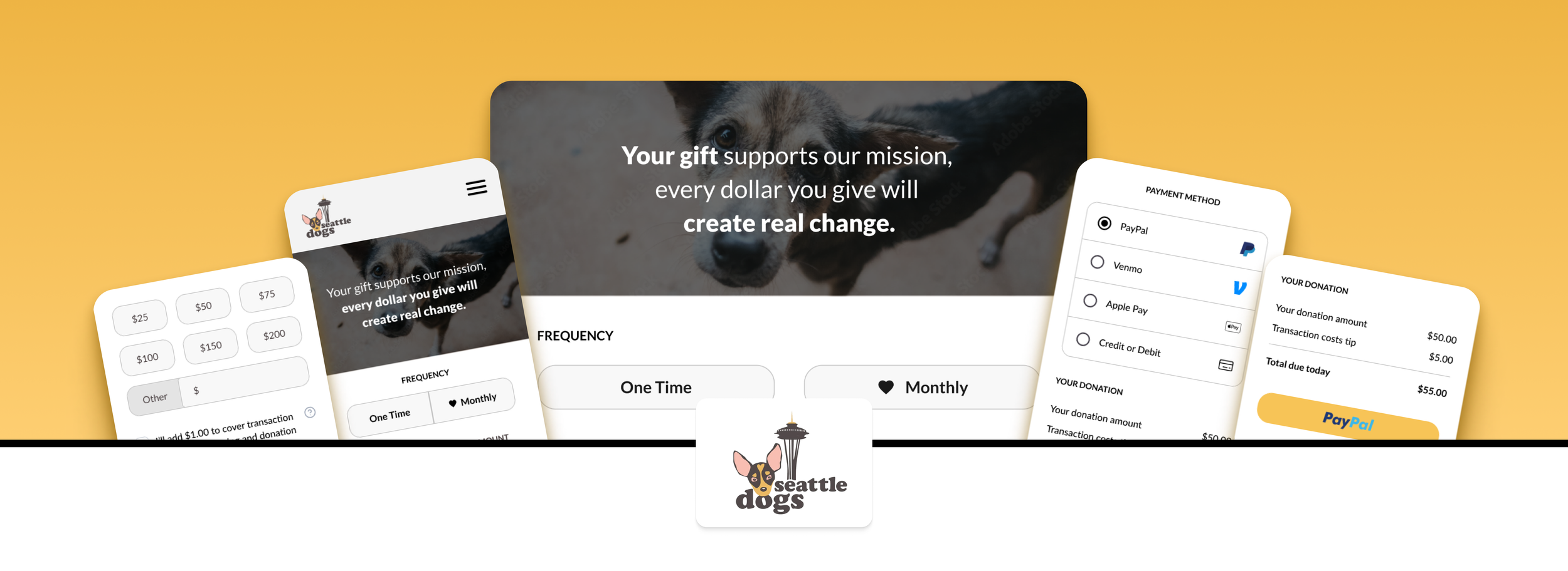
My proposal is to revamp their donation system with a new, dedicated donation page that enhances user experience and potentially increases contributions.
My Role
End-to-end process, from User Research to Wireframe, Prototyping and Design System.
Challenge
The biggest challenge was to thoroughly understand the true pain points users encounter during the payment form process and design an intuitive and efficient payment form that not only addresses these pain points but also enhances the overall user experience.
Goals
Prioritize usability, simplicity, and data protection, aiming to empower users with a seamless payment experience that addresses their concerns.
The two main focuses were:
Eliminate unnecessary steps and improve functionality: Make it effortless for users to navigate the form, ensuring it is intuitive and simple for users of all ages.
Increase organizational transparency: Provide all necessary information to users, enhancing their trust and confidence in the process.
The Current Website
The existing donation process is not user-friendly. The page offers three payment options, but none provide a direct link to the actual donation page. Users are forced to navigate the website and search for the organization, which risks them either abandoning the process entirely or struggling to find the correct organization on the third-party platform.

There’s a lot of room for improvement in the payment process, and the first step is clear: provide users with a functional donation page.
The Research
What does the best donation experience look like? And what about the worst?
The purpose of the research was to discover what’s the best and worst donation experiences, aiming to reduce payment abandonment for Seattle Dogs users. I looked for answers to the following questions:
What form of payment is often used and preferred?
Do users prefer a one-page form or a multi-step process for payment?
What platform do users use most when making a payment?
What are the reasons users abandon the check-out process?
What decisions will the research inform or influence?
What is the users' tech proficiency?
What has been their past experience using the product?
By understanding the answers to these questions, I can design a smooth and efficient payment form process for users. To gather this information, I conducted competitive analysis and surveys with participants who are adults frequently making donations or shopping online.
Why users abandon their cart?
To avoid starting from scratch, I conducted research on cart abandonment rates and found a 2024 quantitative study by the Baymard Institute (the research can be found here). The insights I gathered from it were crucial for continuing my own research.
Competitor analysis
I analyzed four competitors: Feeding Pets of the Homeless, Do Something, Hotel for Homeless Dogs, and Washington Trails Association. While not all of them focus specifically on homelessness or dogs, the goal was to evaluate their donation pages. To do this, I simulated donations on each website. This allowed me to observe a variety of design patterns and functionalities, which was a crucial step in the design process.
From this analysis, I gathered useful features and functionalities that will help inform the creation of a more streamlined and effective donation form.
Feeding Pets of the Homeless
Payment process has an external page.
It looks like a form.
Uses examples of what the donation may mean ($50-helps a pet receive emergency care), which can help users visualize their donation instead of thinking their donating “just” money.
Offers Venmo option.
Hotel for Homeless Dogs
There are two different donation pages available.
One of them features a 'Multiply your impact. Make it Monthly!' button, encouraging users to opt for recurring donations.
However, once clicked, there is no clear option to undo or deselect the monthly donation. After selecting this option, users can choose a start date for the recurring donation, which adds flexibility.
The overall design of the page is visually appealing and user-friendly.
Do Something
The donation process opens in a pop-up window.
There's an FAQ section at the bottom of the page.
When the window is closed without completing the donation, a pop-up appears at the bottom-right corner with a message saying, 'Complete your donation to make a difference,' which serves as a good reminder.
Washington Trails Association
Donation has a multi-step process.
Includes an auto-suggest feature for address entry, streamlining the process and reducing user effort.
Users have access to various payment options, allowing for greater convenience and flexibility in completing their donation.
Ideation
What did the data tell us?
Educators don’t have time to gather teaching resources
Kids require teachable moments in short, bite-sized chunks
So we aimed for a centralized place for:


The Portal, aka ✨ Solution ✨
After analyzing all the data collected so far, it was clear to the team what the solution was: a teaching portal housed within the SCT site that would have all the teaching resources an educator would need to give their students an enriching field trip experience.
Design
Time to design wraparound experiences
Wireframe
In order to facilitate testing procedures, a wireframe was created, following the pre-existing design framework implemented on the SCT website and their guidelines. We aimed for a centralized place full of teaching resources.

Filter
The feature I was most excited to implement was the Filter. The idea is to give educators tools to find the exact content they’re looking for in an easy and practical way, without having to scroll and navigate through different pages to find it.
The filter had the following sections:
(1) Apply Button: Action button for the options selected be filtered.
(2) Shows: List of shows of the season
(3) Type: Either PDF or a video.
(4) Age: Divided by 3 to 13 years old.
(5) Subject: More specific subjects, like “About the Play” or “Activities”
(6) Cards: Available resource materials about the plays.

The portal also included two different types of pages, accessible through the Teaching Portal homepage:
(1) The play page, having the complete information and available content about a specific play of the season in just one place.

(2) Theatre Etiquette, a page where videos about how to behave in theatres are available to watch. Another similar page was the Video Hub, same structure, except it contains videos about behind the scenes or how the production works.

User Testing: what is working and what isn’t.
A cohort of seven participants, including a middle school teacher, engaged in a series of six tasks. These tasks were strategically designed to assess the effectiveness of navigation, filters, breadcrumbs, categories, and labeling, as well as the overall visual user experience of the wireframe. All tests were online, via Zoom. The results were:
“Apply” Doesn’t Apply
Most testers didn’t know to use the “Apply” button to activate the filters.
Confusing Labels
Over half of testers couldn’t find correct content due to unclear category labels.
Content overload
4 out of 7 testers said the portal page was too busy and caused confusion.
Portal Name
All testers said the “Teaching Resources” label was the most accurate name for the portal.
“I like the filtering by age. That can be really useful for my demographic of students.”
- Quote from a 5th Grade Teacher during the testing.
We were in the right track, but still have some fixing to do. The User Testing were able to show me what issues the portal have so I can make smarter product decisions and iterate on changes quickly, and that’s what I started doing on the next stage of the project.
High Fidelity Design
The realistic preview of the portal experience

How was the Portal features improved?
Taking the User Testing in consideration, the Filter feature was improved. I explored a variety of different ways for the Filter Content Cards, always with the focus on giving the information for the user without clustering the card.
(1) In response to negative feedback obtained during User Testing, I eliminated the 'Apply' button to streamline the user experience. Instead, the filter will instantly change the results as soon an option is selected. The Search bar whoever, stayed in this version.
(2) Interactive drop-down menu was added. I optimized the filter functionality to be dynamic and minimalist, aiming to enhance user clarity and avoid confusion.
(3) Filter chips were added, allowing the user to unselect an option or even know what it’s being filtered.
(4) I added the play title, so the user knows from what play each material is from.

Clear and intuitive cards
One aspect I aimed to address was the content overload and the confusion caused by labels that users experienced during the User Testing. Taking this into consideration, I implemented changes to create clear and intuitive cards.

Organized individual play pages

Breadcrumbs and Information Architecture
In the initial wireframe version, buttons were incorporated at the top of the pages with the intention of enhancing accessibility and saving users time as they navigate through the pages. Despite the good intention, this approach did not adhere to a well-structured Information Architecture hierarchy.
Keeping this in consideration, I added breadcrumbs, aligning them with the SCT visual guidelines established by the current website.


Client’s Feedback
“Really love the archive idea, especially thinking about work that’s been done in support of different hobbies and interests. We currently don’t have a way to go back, so it would be so great to offer this.”
- Kevin Malgesini, SCT Managing Director
Presentation Feedback
“Andressa, you’re an excellent presenter. You come across as knowledgeable and speaking from your heart and brain – not notes. Also, you’re modulating your voice well and keeping eye contact going with the camera/audience. Your enthusiasm for your recommendation is shining through very nicely. Good step-through of the problems uncovered in the usability testing.”
- Larry Asher, School of Visual Arts Director
Reflections
If I had more time, I’d have designed a mobile version. While the initial emphasis was on desktop (based on research), incorporating a mobile version would ensure the website's accessibility across all platforms.
This project holds a special place in my professional journey, as the project I am most proud of. I enjoyed every step of the way, from research to the final prototype and presentation. The process not only allowed me to contribute significantly to the project but also gave me huge learning opportunities, giving me experience collaborating with others in a UX setting, expressing my opinions, and making design decisions.